Mobile Responsive Web Design in Vancouver
People scroll on phones. Your website should win there.
Why Responsive Design Matters
More than 70% of visitors reach your website from mobile. If your site loads slowly, feels cramped, or forces users to zoom and struggle, you lose leads instantly.
Responsive design is not just “making it fit.” It’s building a website that feels natural on any screen size, loads fast on mobile networks, and guides users to take action without friction.
At Danoria, we provide mobile responsive web design in Vancouver built for performance, usability, and conversions, not just visuals.
Because mobile users don’t wait. And they don’t forgive bad UX.

Featured Web Design Projects
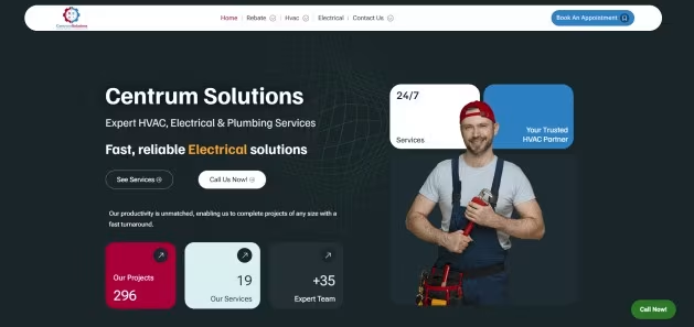
Centrum Solutions
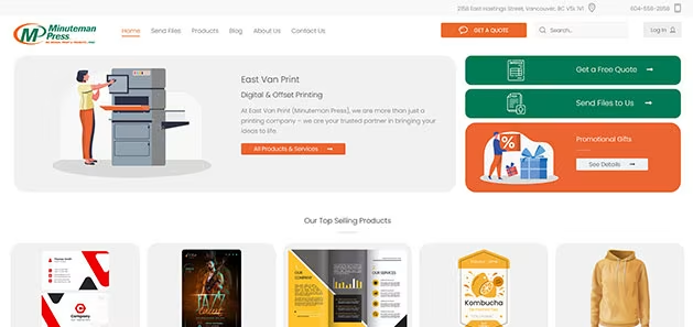
Minuteman Press
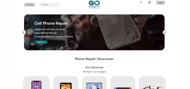
Gadget Ali
We Don’t Talk About Results, Our Clients Do

Sarah L.
Danoria completely transformed our online image. The team is professional, creative, and results-driven.

Amir K.
They understood our goals perfectly and delivered a website that converts visitors into clients.

Hose H.
Our brand finally looks as good as our products. Highly recommend working with them.

Olivia M.
The Danoria team didn’t just design a website, they built our brand identity from the ground up. Every detail feels intentional, and our engagement rates have never been higher.

Daniel P.
Working with Danoria felt effortless. They understood our vision right away and turned it into something far beyond what we imagined.
Our Mobile-First Approach
We don’t design desktop first and “shrink it down.” We build mobile-first layouts where spacing, typography, buttons, and navigation are made for thumbs and real behavior.
That includes:
- tap-friendly CTA buttons
- readable text sizing without zoom
- clean structure with strong hierarchy
- simplified menus and frictionless contact options
Your website should feel effortless on mobile, especially for Vancouver customers who are comparing options fast.
Responsive Design That Boosts SEO
Google prioritizes mobile-friendly websites. Responsive design improves usability, reduces bounce rate, and supports stronger Core Web Vitals. That directly impacts search performance.
We optimize responsive pages for:
- mobile speed and performance
- cleaner page structure and headings
- better engagement signals
- Vancouver Local SEO intent
If you want to compete locally, mobile performance cannot be optional.
Design That Works Across Devices
Your customers switch between phone, tablet, and desktop. Your website should stay consistent everywhere and still look premium.
We build responsive layouts that maintain:
- clean alignment and spacing
- consistent design system
- readable typography on all screens
- professional brand presentation
From small screens to wide monitors, the experience stays smooth.
Speed That Keeps Users Scrolling
Mobile users scroll fast. If your page takes too long to load, they bounce. We design mobile layouts with performance in mind so visitors stay engaged.
Our mobile speed focus includes:
- optimized layout structure
- efficient media usage
- smart spacing and lightweight sections
- better user flow to key actions
- Every second matters on mobile.
User Experience On The Go
Mobile UX is different from desktop UX. Users want quick answers, easy navigation, and simple actions like click-to-call, booking, or form submission.
We design for:
- one-handed navigation
- clear “next step” interaction
- instant access to contact options
- fewer clicks to conversion
A great mobile experience turns scrolling into leads.
Mobile Optimization for Canada-Wide Reach
Vancouver businesses don’t only serve Vancouver. Many of our clients reach customers across Canada. Responsive design keeps your website accessible to everyone, regardless of device.
A mobile-friendly website helps you:
- capture traffic from social media and mobile ads
- convert visitors from all provinces
- build trust faster with clean presentation
- support growth beyond local reach
Responsive Web Design in Vancouver
Danoria creates responsive web design in Vancouver for businesses that want a website that looks premium and performs on every screen. We focus on mobile usability, clean structure, and fast performance because that is what drives real conversions today.
Whether you’re building a new website or upgrading an existing one, responsive design should feel seamless. No broken spacing. No awkward scaling. No hard-to-click buttons. Just a smooth experience that guides visitors toward action.
If your website is not mobile-friendly, you are losing leads daily. Let’s fix it.
Why Brands Choose Danoria
Mobile-first mindset
We design for mobile behavior first, not as an afterthought.
SEO-focused structure
Responsive design that supports rankings and engagement signals.
Conversion-ready layouts
Clear CTA flow built for calls, bookings, and quote requests.
Designed for Vancouver businesses
We understand local competition and local customer intent.
Our Mobile Responsive Web design Process
Discovery

Design Strategy
Development
Testing & Launch
Optimization
What You Gain
- Higher conversion rate from mobile visitors
- Better engagement and lower bounce rate
- Stronger Google rankings through mobile-friendly performance
- Faster website experience and improved Core Web Vitals
- More calls, leads, quote requests, and bookings
Your website becomes easier to use, easier to trust, and easier to choose.
Frequently Asked Questions (FAQ)
1. What is mobile responsive web design?
Mobile responsive web design ensures that your website automatically adapts to any screen size, from smartphones to wide desktop monitors.
It keeps your layout, text, and visuals consistent so users enjoy the same experience everywhere.
At Danoria, every web design and development project is built with responsiveness as a core standard.
2. Why is mobile responsiveness important for SEO?
Google prioritizes mobile-friendly websites.
If your site isn’t responsive, it can hurt your rankings and user engagement.
Our SEO services include technical testing and optimization so your website performs well on both desktop and mobile devices.
3. Can you make my existing website mobile responsive?
Yes.
We can transform your current site into a fully responsive one.
Our website redesign process improves structure, layout, and performance while keeping your brand identity intact.
4. How do you test mobile responsive layouts?
We test across multiple screen sizes, browsers, and operating systems.
Each landing page design and full website is checked manually and with responsive testing tools to ensure pixel-perfect alignment and smooth functionality.
5. Does mobile responsive design affect e-commerce websites too?
Absolutely.
A responsive e-commerce website design means your customers can browse and shop easily on their phones.
We optimize product grids, checkout flows, and navigation for touch screens to make buying faster and easier.
6. What happens if my current site isn’t mobile optimized?
Visitors may leave quickly, and your bounce rate will increase.
Search engines also rank your site lower.
That’s why mobile responsive web design is not optional anymore, it’s essential for both user experience and visibility.
7. How long does it take to make a website responsive?
If your site already has a good structure, it can take as little as one to two weeks.
For full redesigns, timelines vary depending on features, pages, and testing requirements.
8. Do responsive websites load faster?
Yes.
We use lightweight code, optimized images, and smart caching to make sure every page loads quickly.
Our responsive sites are designed to meet Google’s page speed and SEO optimization guidelines.
9. Is mobile responsive design part of your branding process too?
10. Why choose Danoria for mobile responsive web design in Vancouver?
Because we understand design, performance, and behavior.
Our websites look stunning, load fast, and are built to convert.
From web design and development to SEO services, everything works together to make your brand shine across every device.
Ready To Go Mobile
If your website feels slow, messy, or hard to use on phones, it’s costing you business. Let’s redesign your mobile experience so your website actually performs.